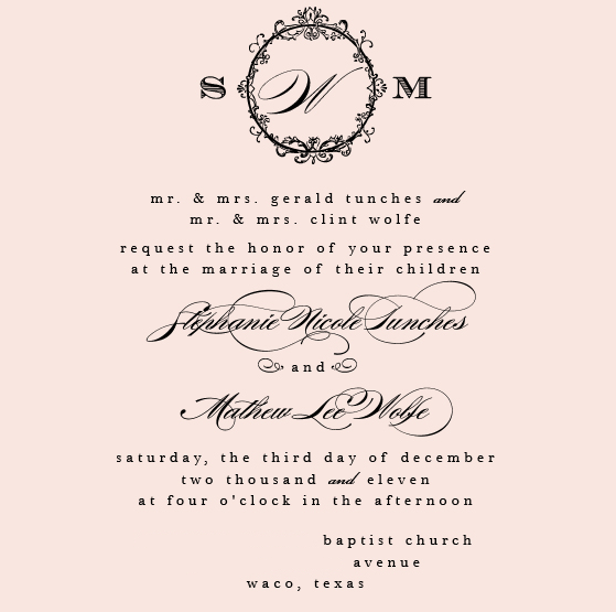
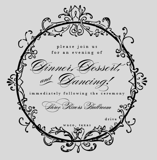
Now that our wedding invitations are in most of the guests hands, I’d like to share them with you (well, kinda).
We worked with Etsy vendor LVandy27 to design the perfect invitations. After receiving her samples we realized we loved the colors that she had (even if they didn’t quite go with our color scheme). Most people probably would’ve freaked that it didn’t go with our colors, but there was so much love, that Mathew and I didn’t mind. Sure, we could’ve changed the colors, but they were just too pretty.
Laura from LVandy27 used gorgeous pearlized shimmer cardstock. It had just the perfect amount of glitz and glamour that we were looking for, and not to mention the vintage-modern theme we had tried to achieve (old school wording, and look, new school paper!)
So, without further ado (and a few edits for privacy and all that) here are our proofs! Wait for later on this week to see the REAL invitations and our postage!


If you like the invitation proofs, just wait til you see the real invitations! I love them! PS Today marks EXACTLY 2 months until our wedding. HOLY COW!

They look beautiful and perfectly in line with your theme! Can’t wait to see the finished product!
How beautiful!! The fonts go together so well! Good job 🙂
LOVE them! They turned out so pretty!
love love love! you have such a great eye for these things steph 🙂
This are AMAZING! I love them. Oh and check my blog I sent you a little awards!
Oh my gosh those are gorgeous! I love the mix of script and typewriter font 🙂 Beautiful!!
Beautiful! Can’t wait to see the real things!
Those are nice!
I love them! I can’t wait to see the finished product!
They’re beautiful!!!! i LOVE the fonts!!
They are gorgeous Steph and I agree with Jasmine, I just love the fonts, so fancy!! 🙂
Wow beautiful!
I love the fonts!
these are gorgeouus!!! Amazing job picking out the perfect invitations for your wedding and theme…I think they are so elegant!
They look amazing!
I loooove lvandy’s invites. I was eyeing a similar style to these too!! Loooove them!
Aw they’re gorgeous! Love them! Doesn’t it feel more real now? 🙂
Love the invites!
Joan Thompson is definitely an independent researcher and writer.
As you’re most likely aware by this time in your own life, girls are irrational creatures.
This Lavender Christmas Gift Bottle oozes pedigree charm rolling around in its resplendent frame.
message in a bottle recently posted…message in a bottle